Changing the narrative
The most interesting jobs are often also the most unexpected.
It was something of a dream brief for any branding agency. An organisation with an incredible story that just needs to be told. Truth well told, as the famous advertising adage goes.
We received a phone call, crackling over the long distance, from an organisation called Horn Relief. They’d heard our name, seen our work and wondered if we might be able to help them with their own brand. We hadn’t heard of Horn Relief. Why not? They were — are — a very impressive humanitarian agency based in Nairobi and working across Kenya, Somalia and Uganda to tackle poverty.
Their founder, Fatima Jibrell, was renowned in the environmental field for her work to end the devastating coal trade in Somalia. They’d pioneered the use and regulation of cash transfers in Africa. They were working on bold new projects to tackle the root causes of poverty in East Africa and beyond, like building a new jetty in Somalia to try to reinvigorate the shipping trade. Interesting, important work.
In short, they were changing the way people think about and deliver aid in Africa. Yet very little in terms of communication had been done to promote the outstanding achievements and changes that Horn Relief had made over the years to African communities.
Stuck in the past
What’s more, they had a name — Horn Relief — that not only locked them to their past as a relief agency working in the Horn of Africa, but had the potential to cause confusion among Western audiences, including institutional funders in the US, a vital source of income for the organisation.
They needed a way of talking about their work that would appeal to a brand-savvy Western audience, but didn’t lose the authenticity that made Horn Relief such a potent force for good in Africa.
It was something of a dream brief for any branding agency. An organisation with an incredible story that just needs to be told. Truth well told, as the famous advertising adage goes.


This was an involved and complex branding project with multiple stakeholders and a board working in both the US and Africa.
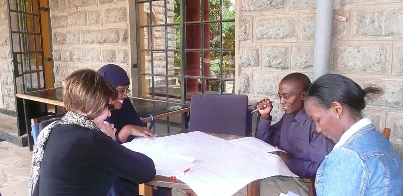
We did much of the early groundwork in the UK — stakeholder research, landscape mapping, peer review and other essentials. But then we flew to Nairobi for further in-depth interviews and a workshop to explore the purpose, vision and values of the organisation.
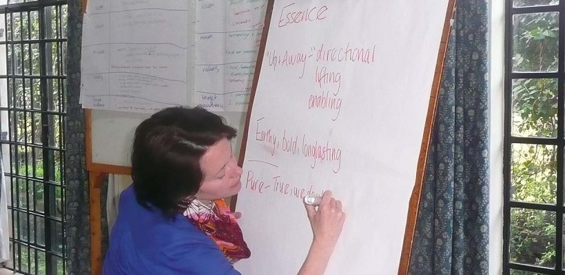
We arrived at what we believed was a truthful and distinctive positioning for Horn Relief — that of an organisation working to create an Africa that was not dependent on aid but on the resourcefulness of Africans themselves.
It was a sentiment or idea we heard expressed time and time again when talking about it with Horn Relief and an idea we felt we simply had to build their brand around. Having captured the essence of the new identity, we began addressing another pressing issue: the name. It had to change — before we could embark on further brand development.
Naming is tricky and this project was especially hard. The organisation had been known as Horn Relief for 20 years. They’d built a reputation on that name and it was of deep sentimental value to the founder and many of the senior team. Keeping it was the easy option, but keeping it would also hold them back.

The art of naming
Naming is subjective. It’s more of an art than a science, though there are always parameters to consider — practical, technical and creative.
There’s also no one-size-fits-all approach. There are descriptive names (British Airways) versus evocative (Virgin) versus compound or invented names (Qantas). These can be useful to gauge where a client feels comfortable, but don’t necessarily make the process any easier. One thing for certain is that there are no sure bets in naming.
It took several weeks before we settled on a name that both we and Horn Relief were happy with. Our initial view that a more creative, evocative name suited the spirit of Horn Relief met with great (and perhaps justified) resistance from Horn Relief. Yet we felt that their preferred option of a descriptive acronym type name, of which the development world is littered, was just not distinctive or interesting enough.
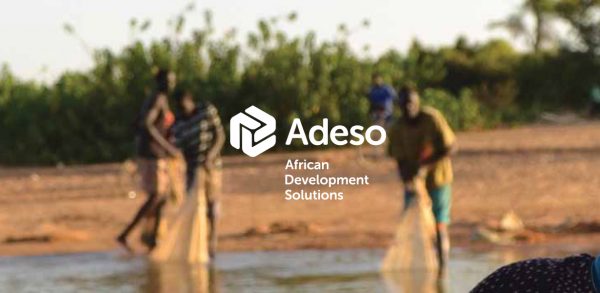
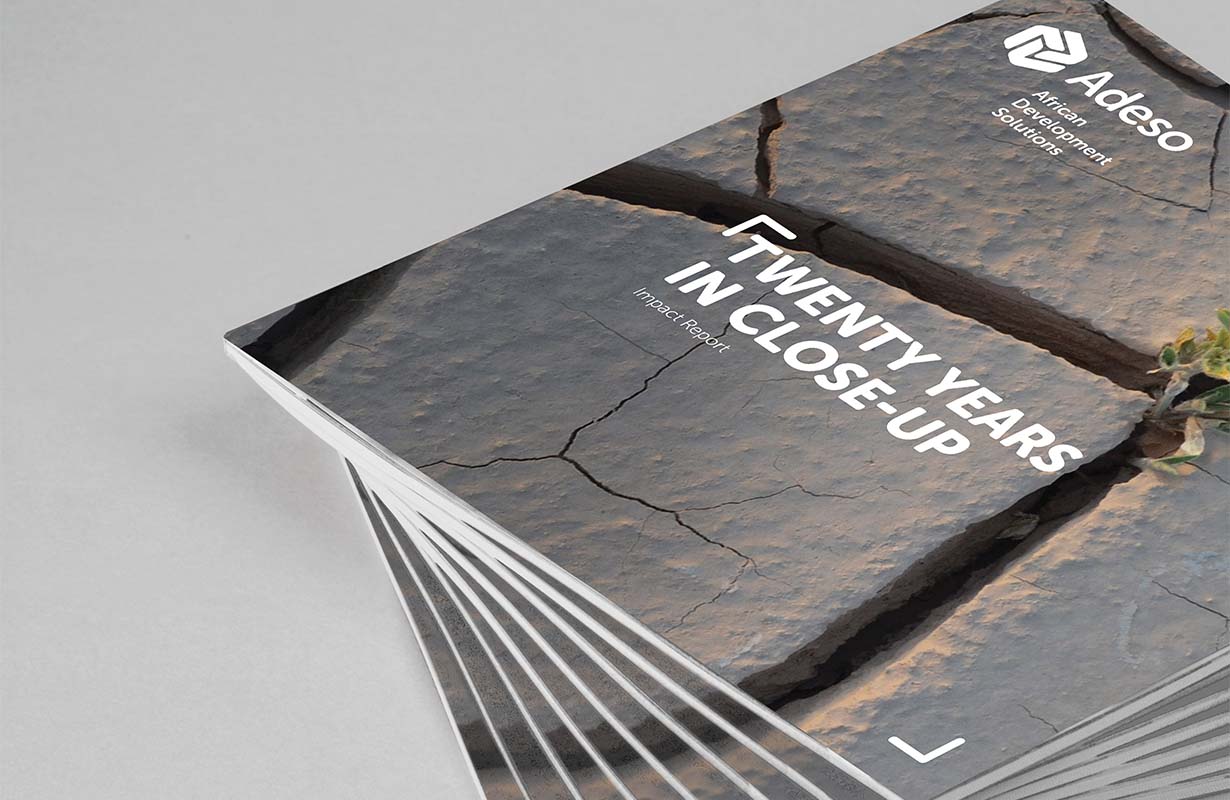
The name we eventually chose — Adeso, an invented word derived from the longer-hand African Development Solutions — was somewhere in the middle. By happy coincidence it’s also the word for ‘now’ in Italian (one of the local languages in Somalia) — apt for the dynamic, results-focused Adeso.
Standing up to scrutiny
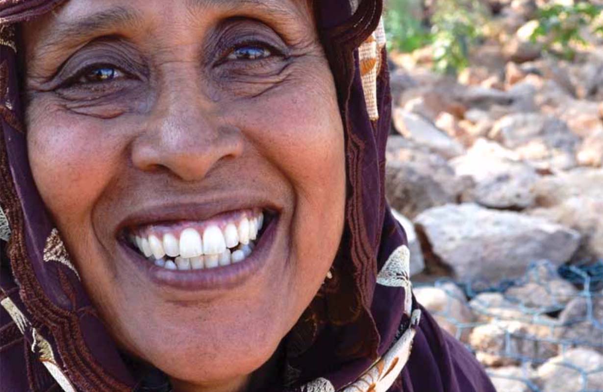
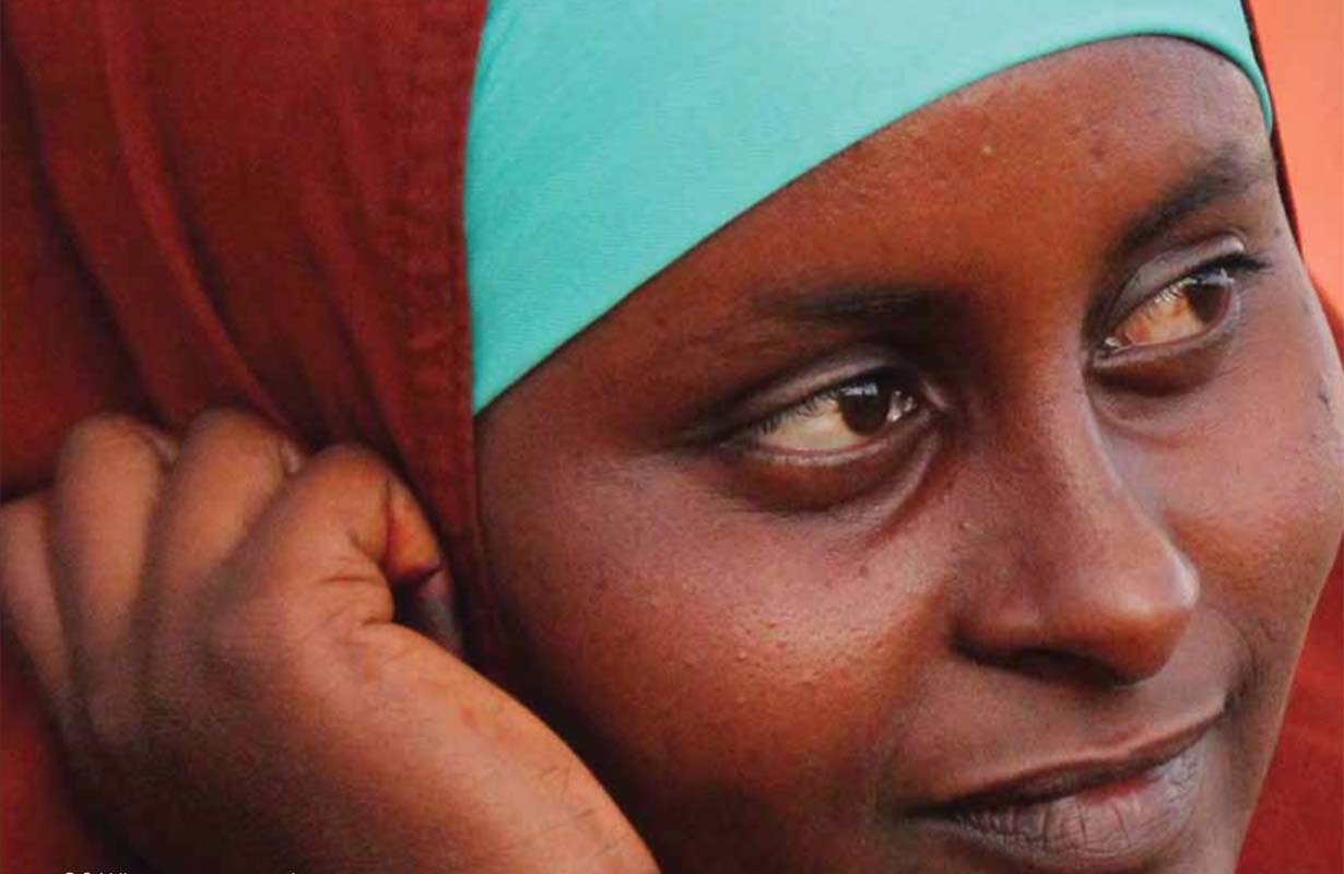
People always think of Africa as dirt red. But we have green forests. We are surrounded by a blue ocean. We are so much more than red
– A memorable stakeholder comment that helped to inform the visual direction of the Adeso brand
By contrast, developing Adeso’s new identity, visually and verbally, was more straightforward. The organisation would need a visual presence that was credible, professional, weighty. Something that could stand up to the scrutiny of US funders.
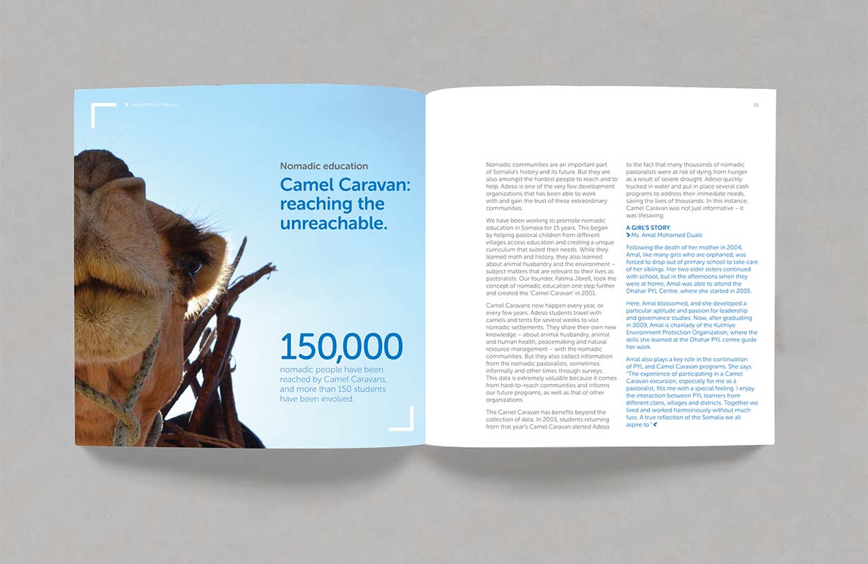
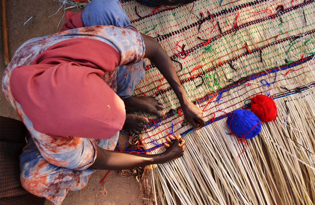
But we also wanted to create a strikingly different portrayal of Africa. No reds, oranges or ochres. No photographs of food parcels being handed out. Instead, beautiful and hopeful images and stories of African ingenuity and strength that spoke of Adeso’s vision of an Africa that is not dependent on aid, but on the resourcefulness of its people.
As one stakeholder said: “People always think of Africa as dirt red. But we have green forests. We are surrounded by a blue ocean. We are so much more than red!”

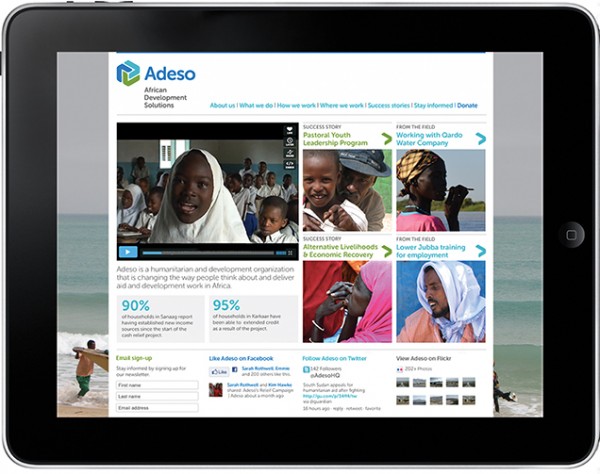
Bringing the brand to life online
Ensuring the brand worked confidently online — an important place for donors and funders — was also a priority.
So, we embarked on user journey planning and created a wordpress CMS with an intuitive backend for users, so staff could easily keep the site up to date.
The Adeso identity refresh was a year-long process from phone call to launch. We continued to work closely with Adeso to roll out their new brand and provided the tools for them to proactively manage their fundraising and communications.
How do you measure success?
It can be difficult to gauge the success of a branding project. How do you measure the success of something as intangible as identity? It lacks the clear performance indicators of a campaign and can take a few years to have an impact.
One measure of success was in the name. Sometimes new names just never stick. And people then revert back to the old name instinctively because the new name feels uncomfortable, strange.
This never happened with Adeso. From the moment we renamed them it just stuck — with us, with Adeso staff, even with Adeso’s founder. It was difficult but we got there and together we created something distinctive and true.
We’re proud of that.


