Clean and natural
A clean, natural brand for a new ethical cosmetics retailer. One that delivers an important message about the sustainability of the beauty industry.
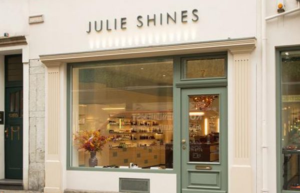
When we met Julie Shines, they’d just began as a new retailer of natural cosmetics, based in Cologne, Germany. The pioneering company was sourcing and selling the best that the sector has to offer in organic, vegan and non-animal-tested products, most of which have won a multitude of beauty awards.


Find what matters
The Julie Shines team came to us for a visual identity that could launch and sustain their new venture. They wanted to bridge the gap between the luxury and ethical aspects of their products, showing that the quality of their cosmetics was thanks to natural origins, not despite them.
This message felt like the seed of an effective new brand. We wanted it to connect with customers who care about the provenance of what they buy, as well as a luxurious experience.
Making it matter more
Our previous experience led us to consider the visual trends in ethical retail. We’d noticed that many emerging high-end products had been presented as more rustic and bespoke in recent years. The use of hand-rendered typography and earth-tone colour palettes had exploded. Inevitably, this aesthetic had then been appropriated by big brands to sell everyday mass-market products. And so those pioneer niche brands have become less distinguishable from the unsustainable mainstream.
Traditional luxury products, on the other hand, have generally conformed to a very different aesthetic. They’ve been presented as clean, minimal and contemporary, with the use of lots of ‘white space’ and simple sans serif typefaces.
They embody a sense of perfection and the view that quality speaks for itself and doesn’t need elaborate branding. But this style can feel clinical and lack the connection to nature that’s helpful in attracting the ethical consumer.

The perfect balance
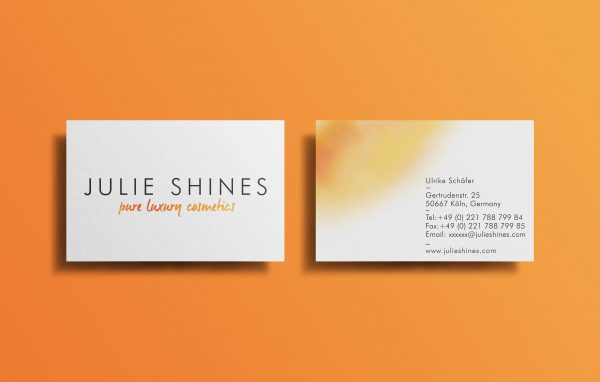
So here was our challenge: finding a balance. Our inspiration came from the heart of the company – Julie Shine’s founding director, Ulrike Schafer. Ulrike takes pride in sourcing products, then testing each and every one personally for quality and effectiveness before they’re granted space on the shop floor.
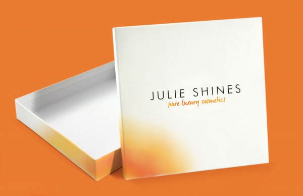
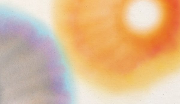
We wanted to explore ways of representing this authentic personal process, and in doing so came across chromatography: a process that can separate the composite colours from ink. This felt like a beautiful and natural way to symbolise the scrutiny that goes into sourcing and testing the products.

With the logo established, we developed new branded assets — including stationery, gift bags and boxes. We wanted to bring forward the mark without it overwhelming the space, so we used the mark as a bleed onto the page and kept plenty of white space around it, and around the typography.
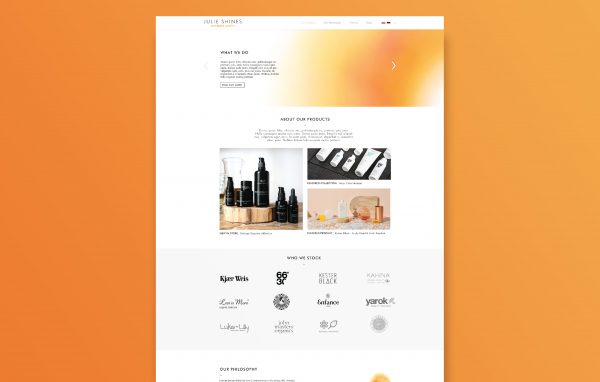
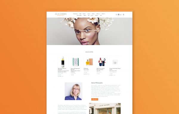
We also created a simple new website design, giving visitors the Julie Shines experience and ultimately attracting them to the physical store.