Bringing in a range of perspectives
Oxleas NHS is a Foundation Trust known primarily for providing mental health services in South London and Kent. Yet few people knew that Oxleas is actually a provider of much broader healthcare services, including community healthcare.
The Trust needed to change perceptions of the scope of its services and of its presence more generally amongst commissioners, GPs and the public. It also needed to sharpen up its identity so it was fit to compete with private healthcare providers in a newly created healthcare ‘marketplace’.

There were two key challenges with this rebrand: how to create a brand shaped with this exacting audience of commissioners looking for costs effectiveness in mind; and how to bring coherency to Oxleas’ broadened service offer.

Taking stakeholders on the journey
Stakeholder engagement is always an integral part of every brand process. It’s critical in bringing the external perspective needed to create a fully-rounded and effective brand. It was especially important in the case of Oxleas. We needed to understand exactly what commissioners were looking for – they were the ones with a significant stake in Oxleas success – and, crucially, we needed to understand their current perception of Oxleas. Of course, it wasn’t just commissioners we needed to engage – it was patients too.
The stakeholder engagement process was sizeable. We undertook 20 one-to-one interviews with senior stakeholders –commissioners, but also executives and service directors from Oxleas. Wider stakeholder engagement – including web surveys and informal questionnaires – was carried out to gauge the views, expectations and needs of Oxleas workforce and patients.
From the stakeholder engagement and wider marketplace review, it became clear that what was needed was a brand that showed Oxleas to be a flexible, collaborative and innovative provider of healthcare – one that would use commissioners’ funds imaginatively to develop and manage the very best healthcare services for people in South London and Kent. It also showed they had an opportunity to build a brand around the integration of mental and community (or physical) heath and begin to carve out a space for themselves as proponents of this more holistic approach to healthcare.
Creating a brand architecture that works

Before we could progress with the creation of a new visual and verbal identity for Oxleas, decisions had to be made around Oxleas’ brand architecture, specifically how to communicate Oxleas internal service directorate structure to an external audience.
There were a number of challenges with the existing internal service directorate structure.
Community felt like a catch-all category and making a distinction between mental health and physical (or community) health was at odds with Oxleas’ strategic aims of aligning mental health with physical health.
Creating a brand architecture that works
We made the strategic decision to only create sub-brands for services aimed at those demographics that had distinct needs and could be categorised. These were: the elderly; children and young people; adults with learning disabilities; and prisoners or offenders.
Our recommendation was that the Oxleas master brand should communicate the remainder of the services i.e. those services that would have been communicated from Oxleas Mental Health and Oxleas Community. We also suggested renaming Oxleas Forensic and Prison as Oxleas Secure Care – this felt more like a public facing brand name.
Once a decision had been made around Oxleas’ brand structure, we could look at how the master brand and sub-brands related to one another. Broadly, there are three categories of brand model – monolithic, endorser and freestanding.
The Oxleas endorser brand model in place
It was important that the directorates could have their own personality and distinct messages, while still feeling like part of the Oxleas brand family. The endorser model was the best way of doing this.
Creating a visual identity

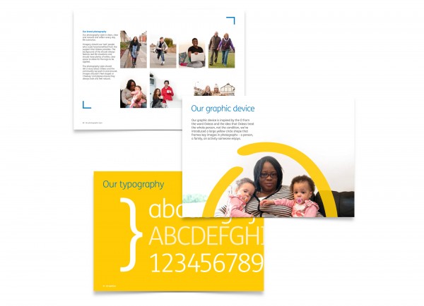
While working out the brand architecture for Oxleas was a significant part of this project, it wasn’t the only part. In fact one of the bolder decisions was Oxleas move away from the use of the standard NHS font in its logo and create a distinctive handwritten logo – something that Oxleas could own and use in a way that a private healthcare provider might do.
The yellow ‘O’ from the logo was is used as a graphic device throughout different materials to bring consistency to previously disjointed communications, and to also communicate Oxleas ‘whole person’ approach to healthcare – not just mental heath, but treatment of the whole person.
We also developed an entirely new photography style for Oxleas – real people in everyday situations in South London and Kent to show Oxleas as being in touch with local lives and committed to creating the very best healthcare service for them.

The brand review process from Neo was thorough and very enlightening – getting that outside perception of our organisation was vital. I think it really helped people engage with the process too. They’re no longer seeing brand as a logo but as something that you live as an organisation
Sally Bryden, Associate Director of Communications & Engagement
We’re about to embark on a brand evaluation process with Oxleas, but initial feedback suggests that the new brand has helped to bring clarity, coherency and personality to a previously clinical and somewhat disparate identity.
Importantly, Oxleas also feel that people are really living the brand – making sure that the core story of ‘taking care of the whole person’ is embedded in all that they do.


