
A shared purpose and identity
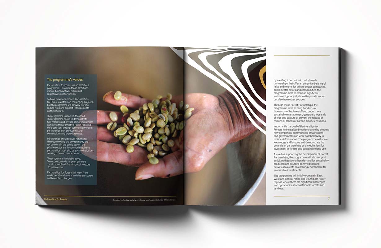
Deforestation and land degradation pose significant threats to the environment, across the world. Not only is it a major contributor to climate change, it can have locally devastating consequences for biodiversity and communities.
Tackling that challenge is a complex and urgent business.
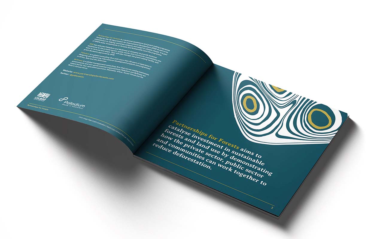
Partnerships for Forests is a programme managed by Palladium, an international development consultancy on behalf of DFID. It aims to show how companies, communities, smallholders and governments can work collaboratively to reduce deforestation.
Partnerships for Forests came to Neo with a challenge. How could they create a brand that supports them to develop relationships with both market driven audiences and non-market driven audiences, around issues of sustainable forestry and land use?

Find what matters
We really liked Neo’s creative approach and energy. They had clearly thought a lot about what we wanted to achieve and how these could be interpreted visually.
– Clare Gorman, Communications Adviser, Partnerships for Forests, Palladium, UK
Our first port of call was the name. The project’s working title — “Investment in Sustainable Forestry and Land Use (IFSLU)” — was too long and its acronym didn’t feel engaging. Our feeling was that a clearer, more concise and accessible name would serve the scheme better and create better engagement with potential partners.
Having worked with the team to settle on a new name we began thinking about the visual expression of the brand. Researching the sector, we could see a lack of individual expression and little differentiation between brands. This was often due to the overuse of the colour green and figurative imagery of trees.
Make it matter more
We felt there was an opportunity to do things a little differently and create a stand-out brand in the sector.
We wanted to find a balance in look and feel between private sector and public interest, both key areas of partnership for the scheme. This meant finding the right mix between a strong, clean look and feel and a softer, organic one.

Finding visual imagery that represented their work in forestry and land use without resorting to literal images of trees was the key to achieving this balance. Through visual exploration we came across imagery of the rings within a tree’s trunk and felt they were a beautifully simple way to represent the scheme, symbolising growth and the accumulation of information.
There was also a strong visual overlap between a tree’s rings and contour lines on topographical maps — both relevant markers of land use and forestry.
The design process was smooth and good communication was kept throughout. Both Sam and Kat were a joy to work with.
– Clare Gorman, Communications Adviser, Partnerships for Forests, Palladium, UK
Developing this idea, we found a Japanese ink technique called suminagashi. This involves dropping ink on to water, letting it spread across the surface, and then adding further drops gradually to create concentric circles. Once the ink is semi-dry, paper is laid on top of the water’s surface and the ink is absorbed into the paper to create a print of the image.
Using this technique we created a mark that serves as a visual link between the scheme and its focus on land use and forestry. By using three sets of conjoining concentric rings we visually represented the partnership approach.
Combining this mark with a balance of bold hand-cut typography and a confident colour palette makes the brand feel different from its counterparts.
Developed through key communications materials, the Partnerships for Forests team are now using this visual story to help foster the collaboration work that needs to grow quickly between all those with a stake in sustainable use of land and protection of forests.
“The design process was smooth and good communication was kept throughout. Both Sam and Kat were a joy to work with,” said Clare Gorman, communications adviser at Partnerships for Forests.


